Challenging Interface: Amazon
Many people know and love amazon; it is perfect for quick and painless shopping. Most of their users have become accustomed to their website and have learned to navigate it with ease. However, Amazon is entirely overwhelming. Their website has too much variety and too much too look at.

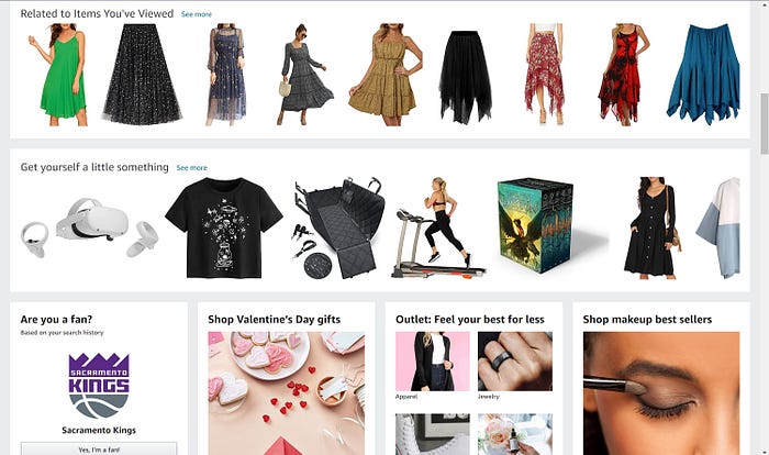
The image on the left is a screenshot of their websites homepage. Looking at this homepage makes me feel anxious because there is just so much to look at and do. Like many websites, Amazon places its main sources of navigating the website in a bar at the top. However it is not as simple as it appears. The sections at the top vary between buttons that lead to new pages and drop down menus that offer even more options. Then all the way to the left is also an option for a side pull out menu.
Then the homepage also has too much content and variety of design on the main page. The page is filled with various recommendations, ads, and other user data. The site shows these things in two ways: category boxes that will take you to a new page or showing products directly through side scrolling sections.

Obviously Amazons main goal is to sell products but they should not be overwhelming their pages with all these different options. To improve their site they should try and simplify everything and place them into greater categories. The navigation bar should contain only drop down menus or buttons, not both. The main page should pick one method of showing the products of categories and it should not be completely packed.
This was just the main page of Amazon’s website, but ultimately its the same issue on every page. The best method would be to simplify.
